
Part 5: Research Results

The results are that further reflection of the sketches has led me to more ideas, such as doing the sculpture drawings all on one page as layers like Wilhelmina Barns-Graham did for her Glacier studies to play more with the notion of movement. Which is also present in Bacon’s paintings in the same room, this drawing as a thinking medium where you can see the artist’s thought processes in the work.As it was a gallery setting, I only had dry media, so using something fast like water-soluble crayons, meant I could do quick captures and then at home apply water and blend the colours if I so desired. Some of them I left dry – like the pop art ones, as I sort of like that childlike scribble for something where the message is all about interpretations of everyday objects or moments that the eye can only imagine. So, the raw style of the crayon also hints at a stylised view of the world.I believe that I choose a good variety of works and that my overall idea was strong enough (that I could find a way to make either sculpture or paintings exciting enough to draw in a gallery setting). To the point that I could go back and do more studies of these chosen images.I think it helped to do research before the visit as it can be quite overwhelming to wander without a clear idea of what to draw. I wanted to spend my time making rather than researching while there. I did not think that I would enjoy doing the two wildcard selections, but I found them quite methodical and helped me understand the artist more by drawing them.

Part 5: Effectiveness of Action Plan

I used the two wildcard choices as my warmup studies. Once I realised that I didn’t have to do a cold copy of the works and just zone in on what I found interesting with the works then I found it easier to make a start. Also, playing with scale and ignoring my need for a ruler I ended up looking at shapes and colours instead of composition which help loosen me up. I also left my William’s study as one side raw crayon, which is how I did it on the day and then with water to blend the colours after the visit. I choose to do just the top left quarter of the image, to help find focus in the busy image.I then moved on to the Pop Art Room and started doing thumbnails of the work around the Hockney image. It was interesting to see how the curator placed the works which were both 2D and 3D. I got distracted with the Richard Smith’s part 3D painting and did a study for that work too. With the Moore’s sculpture I chose to do a tonal study of it from all four angles and really got involved with the composition of the piece and thinking about how the room was lit. So I think the action plan was a success and I came away with the 4 planned studies plus the bonus Richard Smith image.After the visit I went back to these Wildcard studies after the visit and applied water to the crayons to help build up layers of detail and discovered the mottled texture effect with correction fluid on the William’s study from the construction room. Playing on this idea of construction, building materials, the correction fluid looks like concrete texture. The artist used architecture to convey modernist ideas about how art can help rebuild and redefine society values.


Drawing 1.4d
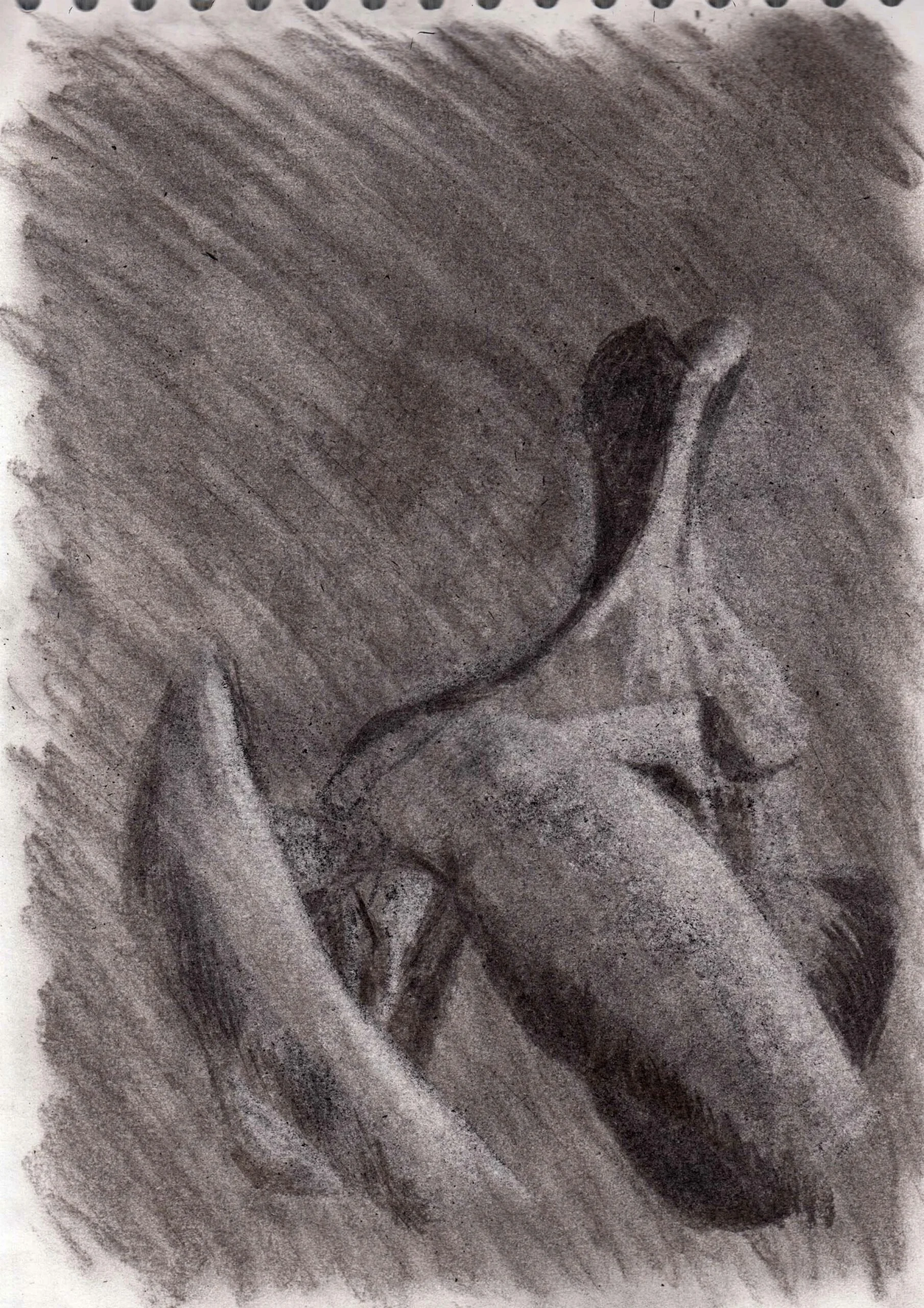
After Henry Moore's Reclining FigureFound in the Francis Bacon & Henry Moore Room.

Drawing 1.4c
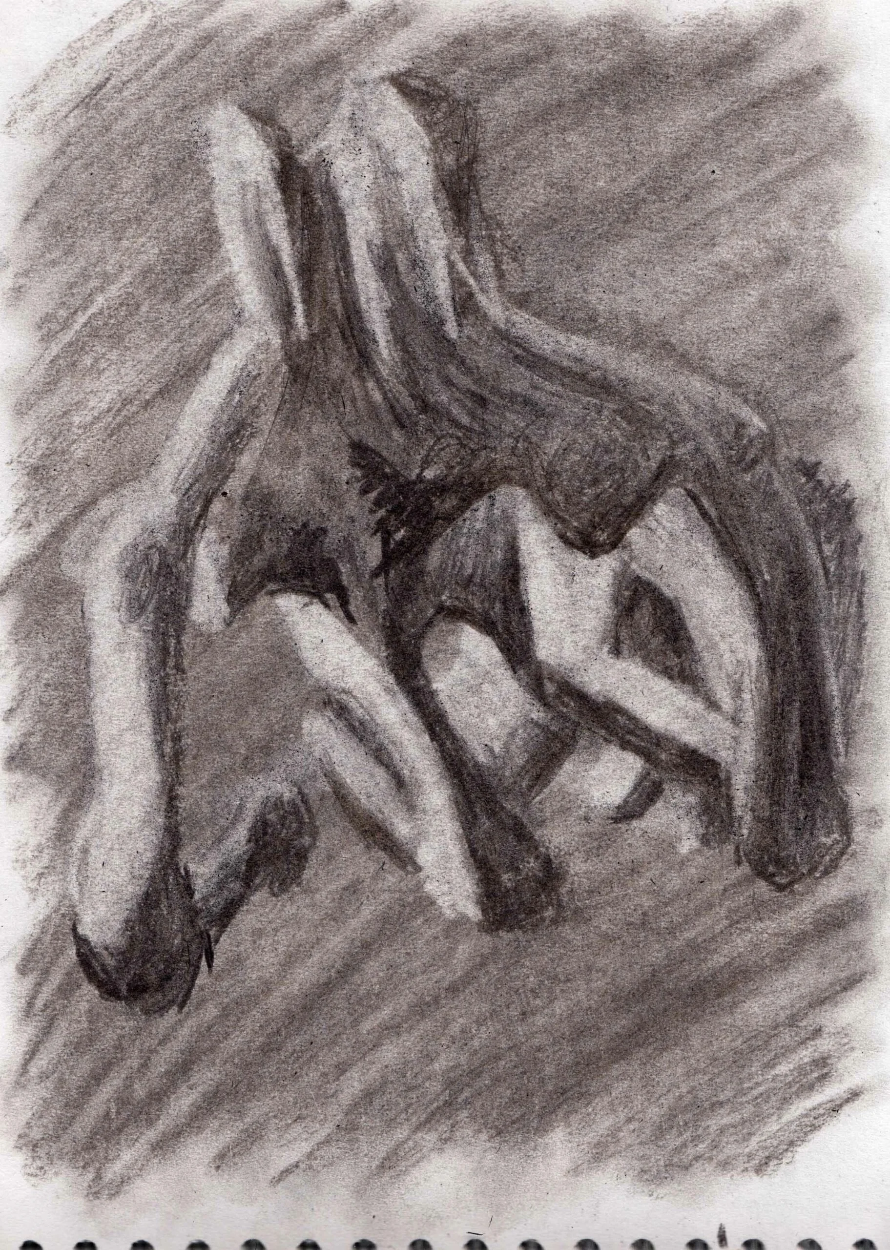
After Henry Moore's Reclining FigureFound in the Francis Bacon & Henry Moore Room.

Drawing 1.4b

After Henry Moore's Reclining FigureFound in the Francis Bacon & Henry Moore Room.

Drawing 1.4

After Henry Moore's Reclining FigureFound in the Francis Bacon & Henry Moore Room.


Full Colour Room Layout Sketches

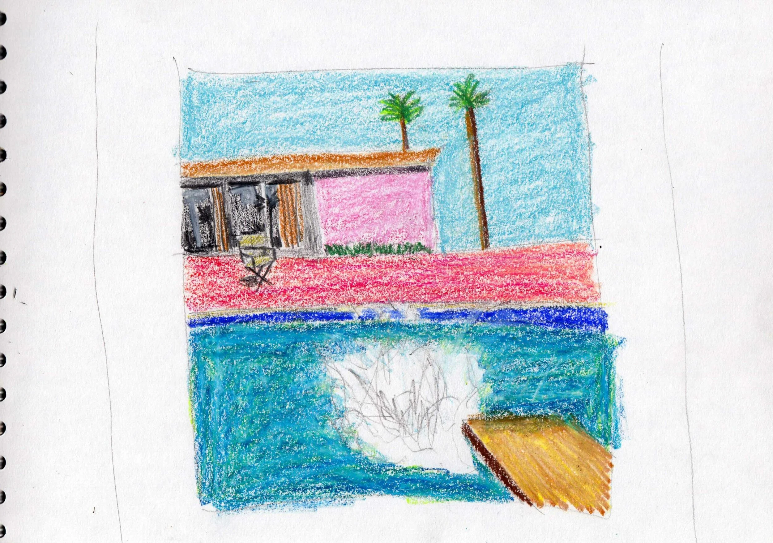
Upon entering this room for the Hockney Study I started with doing thumbnail sketches of the work surrounding it. 


Drawing 1.2

After Denis Williams Painting in Six Related RhythmsFound in the Tate Room called Construction

Drawing 1.1

After Wilhelmina Barns-Graham's Glacier Crystal, Grindelwald.Found in the Tate Room called Fear & Freedom

Part 5 - Plan of Action

Having gone through my previous studies I came up with a mindmap and had a few artists that I wanted to explore at the Tate Britain. I was interested to see a Henry Moore Sculpture as we had done a Moore Drawing in Part two of the course. I planned to do a tonal study of a sculpture, and then in contrast I planned to do a colour study of a David Hockney image. I found artworks by Moore and Hockney by researching the Tate Britain website, and I was interested in how doing tonal drawings from a sculpture would compare with colour studies of 2D could inspire me within a Gallery setting.I also came across an article, about the best works to see at the Tate Britian:https://www.tate.org.uk/visit/tate-britain/display/modern-and-contemporary-british-artOn this page there was a breakdown of 14 rooms. Two of them featured my chosen artists, as I discovered that they had a Room called Full Colour which featured lots of Pop Artists including David Hockney’s A Bigger Splash. The Tate Britain also had two rooms on Moore, so I selected the room that had the thumbnail ‘The Reclining Figure’ which was the shared room with Frances Bacon. I also used this article to select 2 more works. As I the Moore sculpture was also the thumbnail used to advertise this room, I thought it would be fun to then explore two other rooms and draw the thumbnails for those rooms. This took me outside my comfort zone as they focused more on the abstract or and the grid for image generating. My first wildcard choice was Wilhelmina Barns-Graham’s Glacier Crystal, Grindelwald from the room Fear and Freedom. The second choice was Denis William’s Painting in Six Related Rhythms from the room Construction. Some of the keywords that I generated in picking these 4 works included:Barns-Grahams= Abstraction, Rhthym, colour, composition, social influencesWilliams = Abstraction, Grid, Sequence, PatternHockney = Pop Art, Colour, Play on Reality, Social influences, ConsumerismMoore = Figurative, Abstraction, Historical influences, Mark-making